Peter Allinson

  • About
  • Work
  • Archive
  • Awards
vimeo
Email: peter.allinson@uktv.co.uk
  • W Channel Branding

  • Alibi Brand Campaign

  • It’s a Sin (Channel 4 / HBO)

  • UKTV Purpose

  • Stonewall

  • We Hunt Together Title Sequence (UKTV / BBC Studios)

  • DAVE Brand Campaign

  • Dads Army Ghost Ad

  • Playstation

  • UKTV Original Productions

  • Dave Brand

  • The Lion King

  • A Lifetime of Stories

  • Dave Victorious Festival

  • UKTV Purpose

Previous Next Post

W Channel Branding

I helped to lead the process of sharpening W’s positioning and refreshing its on-air identity.

The resulting suite of assets embody a down-to-earth and unfiltered feel, that celebrate W’s inspiring programming and real-life moments in all their imperfect and unique glory.

Our logo is a bold W letter-mark, using a suite of brand colours, led by our primary brand colour of burnt sienna.

The rectangle is purposely off-set to create something that’s distinctive, unique and imperfect.

The logo works on its own – but was also developed to be used as a stencil or a framing device to fully embrace our mantra of ‘Life Unfiltered’, allowing us to show imagery and footage behind our logo as a window into real life. 

Creating a simple, unfiltered way of celebrating our content, as well as celebrating real life in all its glory.

Imagery is at the forefront of our brand and should always reflect real life in a diverse, genuine, and authentic way. Candid moments that feel unfiltered rather than staged.

A warm new colour palette that is colourful and vibrant.

A new font family called Heading now which comes in a large variety of weights and type styles to further establish a brand that feels diverse and unique.

And finally, throughout our branded assets we have used real world textures – such as paper, paint and natural wall textures that feel tactile and real.

We aim to fully embrace our mantra of ‘Life Unfiltered’, by creating a set of idents based around our brand promise of ‘Genuine Human Moments’.

We collaborated with a content sourcing agency, to help us find a series of user-generated clips and home videos that capture genuine human moments.

These idents offer authentic moments that celebrate the ups and downs and showcase the diversity of real life in all its glory. We have incorporated key channel themes, including parenthood, home improvements, cooking, relationships, emergency services and health and well-being.

During this process we also worked with an award-winning music composer to create a bespoke melody for the W Channel. Often referred to as sonic branding, this piece of audio is effortlessly incorporated into a set of five bespoke music tracks that are used across our channel assets.

Our on-screen packaging demonstrates how we have implemented our brand assets to create a new look and feel and establish a bold new brand identity.

Our launch campaign included a number of TV commercials & marketing material to help build awareness of our new brand across TV, social media & out of home.

This kicked off with a teaser campaign letting people know that W was going to be Free on TV.

This is Life Unfiltered.

Permalink
Filed under: Work
Previous Next Post

Alibi Brand Campaign

On Alibi, there’s always more going on than meets the eye.

Our objective was to improve brand perceptions of Alibi among crime drama viewers.

To do this we wanted to bring to life our tagline of ‘more than meets the eye’ by creating the joy and excitement of discovering hidden phrases.

Our campaign used clever copywriting to challenge viewers by revealing hidden messages across digital screens throughout the UK.

Our brand campaign went live across multiple digital screens during a nationwide campaign.

Animated screens revealed hidden messages across the country – prompting people with a curious mind to take a second look; bringing to life our tagline of ‘more than meets the eye’.

To promote the Alibi channel’s new brand proposition of ‘more than meets the eye’, we wanted to engage with the curiously-minded fans of crime drama by creating a real world experience that offers something unexpected and challenges their perspectives.

Using the optical illusion of anamorphic type, we developed a large installation that can only be seen and deciphered from a certain point and perspective. This installation will be seen across the UK from Manchester to London.

This installation allows people to engage and interact with our brand and was created as part of a wider campaign to show that on Alibi there is always more going on than meets the eye.

An on-air promo was also broadcast as part of the brand campaign. Using our new and exclusive content to encapsulate our brand message of ‘more than meets the eye’.

Permalink
Filed under: Work
Previous Next Post

It’s a Sin (Channel 4 / HBO)

A Channel 4 and HBO Max production from the mind behind Queer as Folk, Cucumber, and Banana, It’s a Sin is Russell T Davies’ take on the AIDS crisis in the 1980s and will tell the story of three friends who move to London as the HIV/AIDS epidemic unfolds.

I was approached by Russell and the production team to help them create a logo design for the show and a simple title card to be used at the start of each episode.

Russell asks ‘What is IT’S A SIN?  It’s provocative.  It’s a statement.  It’s in the 80s. It’s a black and white t-shirt.”

In the 80s, slogan T-shirts reached saturation point because of one woman: Katharine Hamnett. Dressed in a “58% Don’t Want Pershing” T-shirt, she was photographed shaking hands with the then prime minister Margaret Thatcher at a Downing Street reception for London fashion week designers in 1984.

Hamnett’s style appeared all over the world. Wham! wore a T-shirt with the slogan “Number One” – and later “Choose Life”; Frankie Goes to Hollywood had “Frankie Says Relax”. Hamnett’s T-shirts became cultural signposts to the times we lived in.

This iconic style helped us to develop a logo for the show, seen below.

We experimented with a few different animation styles – before opting for a very simple title card.

Animation Test 01: Screen Printed
This has a layered, screen printed quality to it. Building up layers of ink and words to form our fully formed title.
This is a bold statement. It’s provocative. A headline / news article worth talking about.

Animation Test 02: Fabric
This is proudly flying the flag. Pushing back against the establishment. Wearing the t-shirt and making a stand.
It’s tapping into the mood and the culture of the 80’s; this an iconic Katherine Hamnet style statement.

Final Title Card:

Both heart-warming and heart-breaking in equal measure, It’s a Sin will cover the entire decade, and will follow the protagonists’ friendships and love lives as they deal with the AIDS crisis.

Permalink
Filed under: Work
Previous Next Post

UKTV Purpose

At UKTV, we developed a new Purpose and Mission Statement which sets us apart in the industry.

We believe in TV with personality.

As we begin to face in to a new world and a new way of working, UKTV have established their Purpose – to bring programmes that are hand-picked for their quality and available on any device – all crafted by fans, for fans. TV with personality.

This video tells that story through animation that is creatively striking and visually captivating – with an element of hand-made craft. 

Design Director – Peter Allinson

Design Producer – Sophie Bryant

Creative Director – Scott Russell

Voiced by UKTV colleagues

A creative collaboration with Blind Pig

Animation – Blind Pig

Design & Animation Lead – Lawrence Scanlon

Design – Christine Peters

Animation Assist – Will Smith

Creative Director – Ric Comline

EP & Producer – Thierry Levy

Permalink
Filed under: Work
Previous Next Post

Stonewall

To support pride month we worked closely with the team at Stonewall to create a series of TV commercials and sponsorship idents that were played out during our network air-time across UKTV.

This campaign aims to raise awareness of the incredible individuals that make up the LGBTQ+ community and continue to champion acceptance without exception.

We were fortunate enough to work directly with Sir Ian Mckellen, a Stonewall ambassador who has spent years fighting for equality at home, at school, at work and in the streets.

So who better to voice our message of acceptance without exception, than Sir Ian himself!

Taking Stonewalls brand assets of bright colours, vibrant portraits and punchy typography – we created a typographically driven campaign that communicates our message with bold activism and unapologetic pride.

Working with Stonewall to serve their community better and bring people together to accomplish the organisation’s important work.

Permalink
Filed under: Work
Previous Next Post

We Hunt Together Title Sequence (UKTV / BBC Studios)

Promax Europe GOLD
Best Opening / Titles

CreativePool Award
Best Production

2 x Drum Design Awards
Best Moving Imagery Design / Best Photography

Motion Design Awards
Video of the day

We produced the opening title sequence for the thrilling drama series We Hunt Together. A UKTV Original production in collaboration with BBC Studios.

We Hunt Together tells of two couples in a provocative new take on the cat-and-mouse thriller. The killers are hunting their victims: the detectives are hunting the killers and the streets are their hunting ground. Love and murder interlocked in a dance to the death. We Hunt Together is different. It’s a complex and well-crafted character-led thriller. It’s contemporary and unique in style. It’s modern, thought-provoking and edgy. The opening titles needed to encompass these themes and invite the viewer into this dangerous, beautiful, multi layered London.

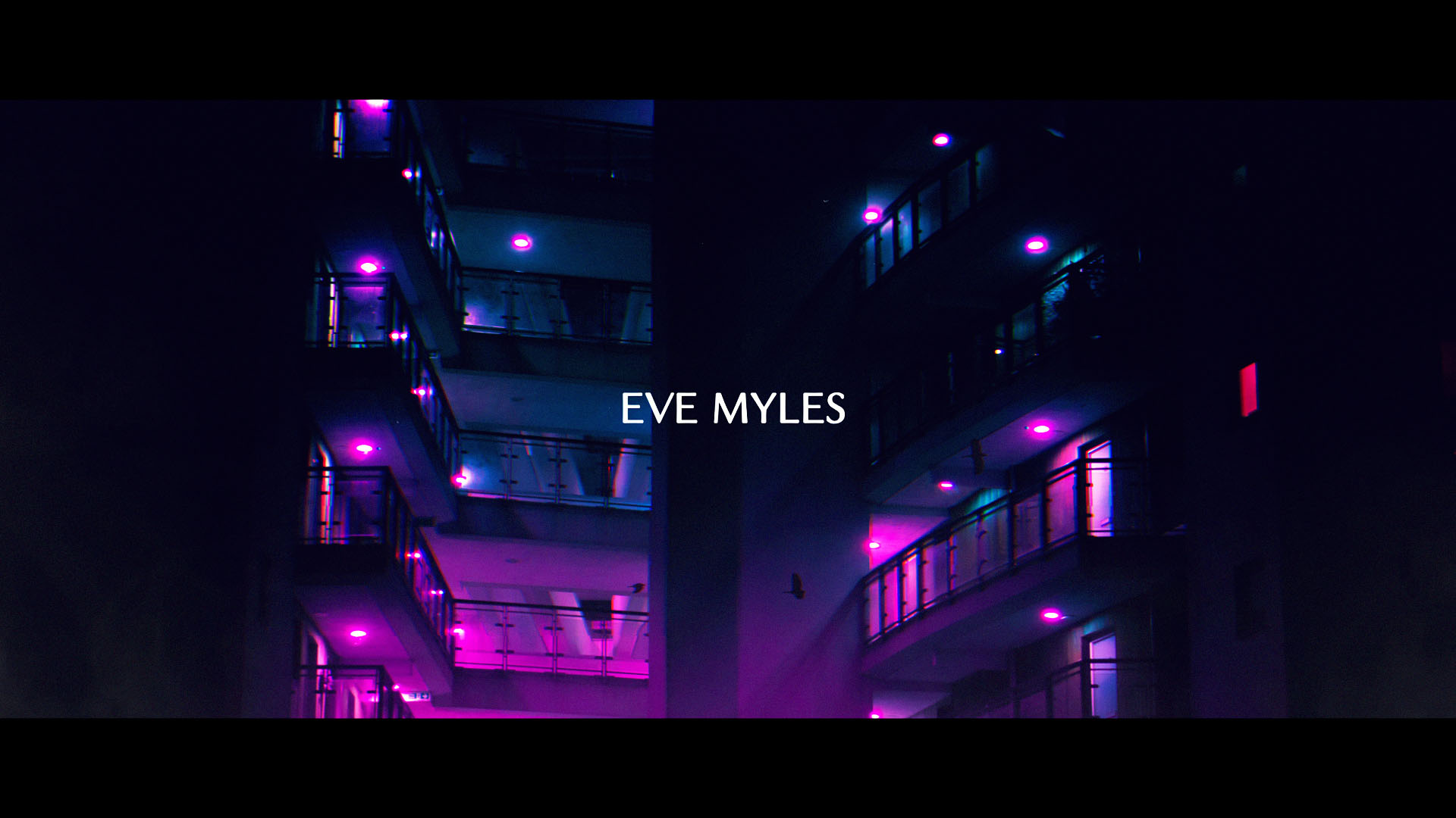
The title sequence is set in a world of glowing neon where predators hunt together in the shadows. A tale of complex characters and the vibrant, violent world they inhabit. There’s a heightened reality to this world, which we see through our characters eyes. A fantastical setting of glowing colour and neon light.

Predatory animals form the alter egos of our four main protagonists, creating a face-off between predators. As one pair runs, another pursues. These fierce predators appear without warning, much like the bursts of violence that happen throughout the show, catching you off-guard, making you feel unsettled and uncomfortable.

Buzzing street lights flicker and neon lights burst to create hidden messages of the violence and danger that is ever-present.

To create the neon-lit London we commissioned bespoke photography that captures London locations that are specific to the show in order to maximise the look and create something unique.

To achieve this we collaborated with Eugene Tumusiime, a new and upcoming Photographer, Art Director, and self-confessed Nightcrawler, who specialises in transforming London at night into vibrant neon.

The images and colour palette express that off kilter under belly setting – that North London Noir – to create a distinctive look with a kinetic energy to seduce the viewer.

The track by a band She Drew the Gun, which is ironically called Paradise, establishes the sense of danger, and otherness about our world and our characters.

This is a place you don’t usually go or see on television.

So strap yourself in.

https://brief.promax.org/index.php/article/neon-flashes-reveal-clues-in-uktvs-main-titles-for-we-hunt-together

https://creativepool.com/magazine/features/behind-the-idea-snarling-neon-with-we-hunt-together-and-uktv.23292

Permalink
Filed under: Work
Previous Next Post

DAVE Brand Campaign

PromaxBDA Europe 2019 GOLD WINNER
Best Channel Key Art Campaign

The Drum 2018 / 2019 OOH Awards GOLD WINNER
Best Use Of Long Copy

PromaxBDA UK 2018 SILVER WINNER
Best OOH Campaign

PromaxBDA Europe 2018 SILVER WINNER
Best Channel Key Art/Poster Campaign

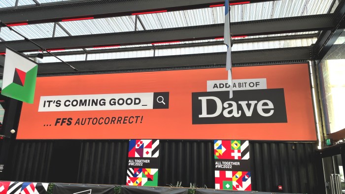
We were tasked with creating an off-air brand presence throughout 2017 and 2018 to raise awareness of Dave and build on it’s funny and knowing tone of voice.

We created a series of shareable copy-based ads that are visible out of home, across London Underground, National Rail, transport D6 and Street talk ad spaces.

01 TubeCard 280x609.indd01 TubeCard 280x609.indd01 TubeCard 280x609.indd01 LDN TubeCard 280x609 Flowchart.inddSouthWest Trains_609x280.indd

Creative Manager – Paul Philpott

Head of Design – Peter Allinson

Design Producer – Sophie Yeoman

Creatives – Tom Corbett and Martin Graham

Print Designers – Veer Assi and Dani Liqueri

Made by UKTV Creative
© UKTV Media Limited

Permalink
Filed under: Work
Previous Next Post

Dads Army Ghost Ad

Promax UK 2019 GOLD WINNER
Best 360 Campaign

The DRUM Awards 2019 Highly Commended
Visual Craft

To celebrate the release of Dad’s Army: The Lost Episodes on Gold, UKTV has unveiled a huge 1940s army-recruitment style mural which has been specially designed to look as if it has been in place for decades.

The specially created, time-weathered ‘ghost billboard’ harks back to WW2 propaganda advertising and has been designed to appear as if it has re-emerged after being lost to the ages.

Working with Hearts & Science and Talon Outdoor, the 45ft tall mural installed in Clerkenwell, East London took four artists from street art collective Global Street Art Agency 50 hours to painstakingly create using a combination of emulsion and over 250 cans of spray-paint. The mural was sandblasted to make it looked aged and is the first of its kind to be created by Global Street Art Agency. The artwork, designed by UKTV Creative head of design Peter Allinson, features the new cast from the re-made episodes of the much loved British comedy classic.

It hit the press and national newspapers and made an impact with Dads Army fans across social media.

Even Captain Mainwaring himself tweeted about it!

Dad’s Army: Lost Episodes – 360 Campaign

Promax UK 2019 GOLD WINNER
Best 360 Campaign

Permalink
Filed under: Work
Previous Next Post

Playstation

Following a creative pitch, we were appointed by Sony to visually assert the Playstation brand’s iconic status. Our response was a simple, powerful solution which put the PlayStation logo at the heart of the brand, establishing a clear brand hierarchy. This was supported by a strong brand colour and a vibrant and dynamic rendering of the PlayStation shapes. Throughout the project we worked closely with Sony’s internal creative departments, creating a branding solution which works consistently across all platforms, including TV, print and outdoor advertising, online, social media, retail and packaging.


Creative Director: Marcus Jones / Matt Penney

Lead Designer: Peter Allinson

© dunningpenneyjones Ltd

Permalink
Filed under: Work
Previous Next Post

UKTV Original Productions

PromaxBDA Europe 2018 SILVER WINNER
Channel logo design across multiple media

The launch of the new branding follows UKTV’s track record for launching successful original shows. In 2016, it committed over £150m to new programming which resulted in more Original shows across the network than ever before.

The new branding really captures the creative process involved in creating our Original productions, from script writing to set design; storyboarding to editing. Basically, the unsung heroes that are often hidden behind the scenes.

Everything was filmed and edited at UKTV’s headquarters in Hammersmith across a two-day shoot.

Being able to bring content like this to life, in-house is truly rewarding. It also enables us to take more risks and do things differently to set ourselves apart from our competitors.

Working with the hugely talented Alison Carmichael provided us with an additional opportunity, to create a beautiful and truly bespoke logo. The result is a confident wordmark that feels crafted and authentic, like a stamp of approval or a signature.


Broadcast_Web_Ad

Articles:

http://www.digitalartsonline.co.uk/news/graphic-design/2017s-biggest-logo-redesigns/

http://brief.promaxbda.org/article/brand-rebrand-uktv-originals

http://www.thedrum.com/creative-works/project/uktv-creative-uktv-uktv-originals-branding

https://lbbonline.com/news/uktv-originals-unveils-new-look-branding/

Credits:

Director / Head of Design – Peter Allinson – UKTV

Design Producer – Sophie Yeoman – UKTV

Marketing Manager – Emily Latham – UKTV

Producers – Sophie Fox / Deane McDonald – UKTV

Hand Lettering Artist – Alison Carmichael

DOP – Steve Weiser

Art Dept – Chris Williams

Camera Assit – Poe Panayioyou

Sound Design – Dave Connolly

Runner – Bettie Cooper

Made by UKTV Creative
© UKTV Media Limited

Permalink
Filed under: Work
Previous Next Post

Dave Brand

The Dave channel is an iconic brand and so is it’s comedic tone of voice.

But Dave’s looked the same since 2014 so we wanted to give the brand a little makeover and spruce things up a bit, with a fresh batch of animated icons to be used wherever you can find Dave.

Wether it’s a flapping fish, a broken bicycle, a set of spanners or a clucking cockerel. These silly little icons help to bring a bit of funny to your day, in a way that only Dave can.

A logo lock-up that brings consistency across the Dave brand.

A wide selection of icons were created based on specific categories; as well as a selection of programme-specific icons.

The icon style uses simple pictogram designs for maximum clarity.

A roughen edges texture is used to retain the quirkiness of the Dave brand.

These icons have been designed so that they are scalable for multi platform use.

Icons will be used across on-air, off-air and social assets where applicable.

Permalink
Filed under: Work
Previous Next Post

The Lion King

For the Broadway production, we created an entirely new TV campaign from concept to post-production. We began with a green screen shoot involving the full cast in NYC and then continued with intensive editing, grading and compositing in London. Directed by Brett Sullivan and produced by Clayton Jacobsen.

We also created a variety of digital screens that were played out across broadway.

These included: Disney Store, Chevy Store and ABC Television Studios.

Art Director and Head of Design: Peter Allinson

Creative Directors: Brett Sullivan / Clayton Jacobsen

Designers: Chiara Zonca / Brendon Bennett

© Steam Motion and Sound Ltd

Permalink
Filed under: Work
Previous Next Post

A Lifetime of Stories

This brand spot for UKTV is an animated journey which aims to reflect ‘a lifetime of stories’ through their portfolio of 10 diverse channels.

Produced by UKTV Creative, who worked with London based animation studio, Animade, on the character design, set build and visual treatments to create a hybrid animation with 2D and 3D effects.

It was all built and animated using Cinema 4D and After Effects at Animade’s studio in East London.

UKTV_Network_Character_02
UKTV_Network_Character_03

UKTV_Network_Character GIFs

Network GIF 01Network GIF 02

Through a development process of style frames and animatics – we crafted a hybrid animation that mixed 2D and 3D visual styles with beautifully rendered environments that appear to be made from watercolour and brush strokes; all to bring a unique tactile and artistic look to the final animation.

UKTV_Network_Promo_02
UKTV_Network_Promo_05
UKTV_Network_Promo_06
UKTV_Network_Promo_10

We also worked with music composer and sound designer, Dave Connelly (Molecular Sound) to create a bespoke piece of music for the ad.

Audio was critical to the overall effect of the animation. We didn’t want the animation or soundtrack to feel traditional. Instead we wanted something bespoke and unexpected to take viewers on a journey, audibly as well as visually.

Behind the scenes photos at Animade

UKTV_Network_BHS_01UKTV_Network_BHS_03UKTV_Network_BHS_08UKTV_Network_BHS_04UKTV_Network_BHS_10

Written and Directed by: Peter Allinson and Scott Russell
Senior Producer: Celia Bayne
Producer: Cheri Darbon
Head of Design: Peter Allinson
Animation Studio: Animade
Composer: Dave Connolly, Molecular Sound

Made by UKTV Creative
© UKTV Media Limited

Permalink
Filed under: Work
Previous Next Post

Dave Victorious Festival

Promax UK 2018 GOLD WINNER
Best PR and Experimental stunt

Dave were proud to sponsor Victorious Festival this year, and by sponsor we mean, we made all their signs better (and we will not apologise)

250 pieces of copy were written for the festival and 115 pieces of creative material were delivered in order to cover the entire festival.

IMG_5576IMG_5673IMG_5675IMG_5619IMG_5580IMG_5607IMG_5612IMG_5713IMG_5857IMG_5601IMG_6096IMG_6119

Made by UKTV Creative
© UKTV Media Limited

Permalink
Filed under: Work
Previous Next Post

UKTV Purpose

In January 2016, we set out to redefine UKTV’s purpose, following a successful campaign in 2015 to launch our new company strategy and values.

In collaboration with Cookie Studio, we created a beautiful animation to capture UKTV, the place where anything is possible.   The solution was to build a 3D isometric world that showcases UKTV and our portfolio of 11 channel brands through a series of immersive and highly detailed brand spaces. The film explored areas of the office familiar to colleagues including the spiral staircase, the swinging chairs and our brand logos. We wanted colleagues to relate to the film and feel proud to be part of UKTV.    The 3D spaces where created as a looping animations for use online and across social – enabling viewers to have more time to enjoy the detail of each space in their own time.   To complete this piece, we decided that if the video was intended for our employees – it should be voiced by our employees as well. This helps to get everybody involved in a piece that we can all be proud of and further reinforce our company purpose: UKTV – Entertaining the nation from a place where anything is possible

Director: Peter Allinson

Script: Scott Russell

VO: UKTV employees
Concept by: Peter Allinson

Comms: Soraya Shaboon

A creative collaboration with Cookie Studio

Permalink
Filed under: Work
 

Loading Comments...